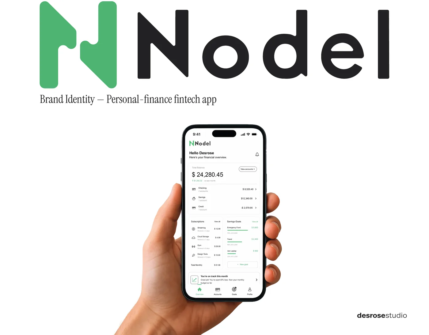
Nodel
A finance app that gets noticed through restraint, in a market that bets everything on intensity.
- Sector
- Fintech, personal finance
- Scope
- Symbol, logotype, colour, typography, product application
- Format
- Concept project, 14 boards
Brand identity
Every identity starts from a real constraint: a needle, a 16-pixel icon, a market that shouts. The two case studies below show the method, from the brief to the finished system.
Both are concept projects, built to the standard of client work.
Read on the page, or download the PDF.
A finance app that gets noticed through restraint, in a market that bets everything on intensity.
A monogram that has to survive a needle at two centimetres.
Think before drawing. Explore before deciding. Build before applying.
The brief is reframed into the real problem, and into a few words every later decision has to serve.
Wide exploration on paper first. The form that survives is then regularised on a grid.
Typography, colour, lockups, minimum sizes and rules of use, so the brand holds on every surface.
The system is tested where the brand will really live: product, packaging, print and screen.