Brand identity
Case study · Concept project
Nodel
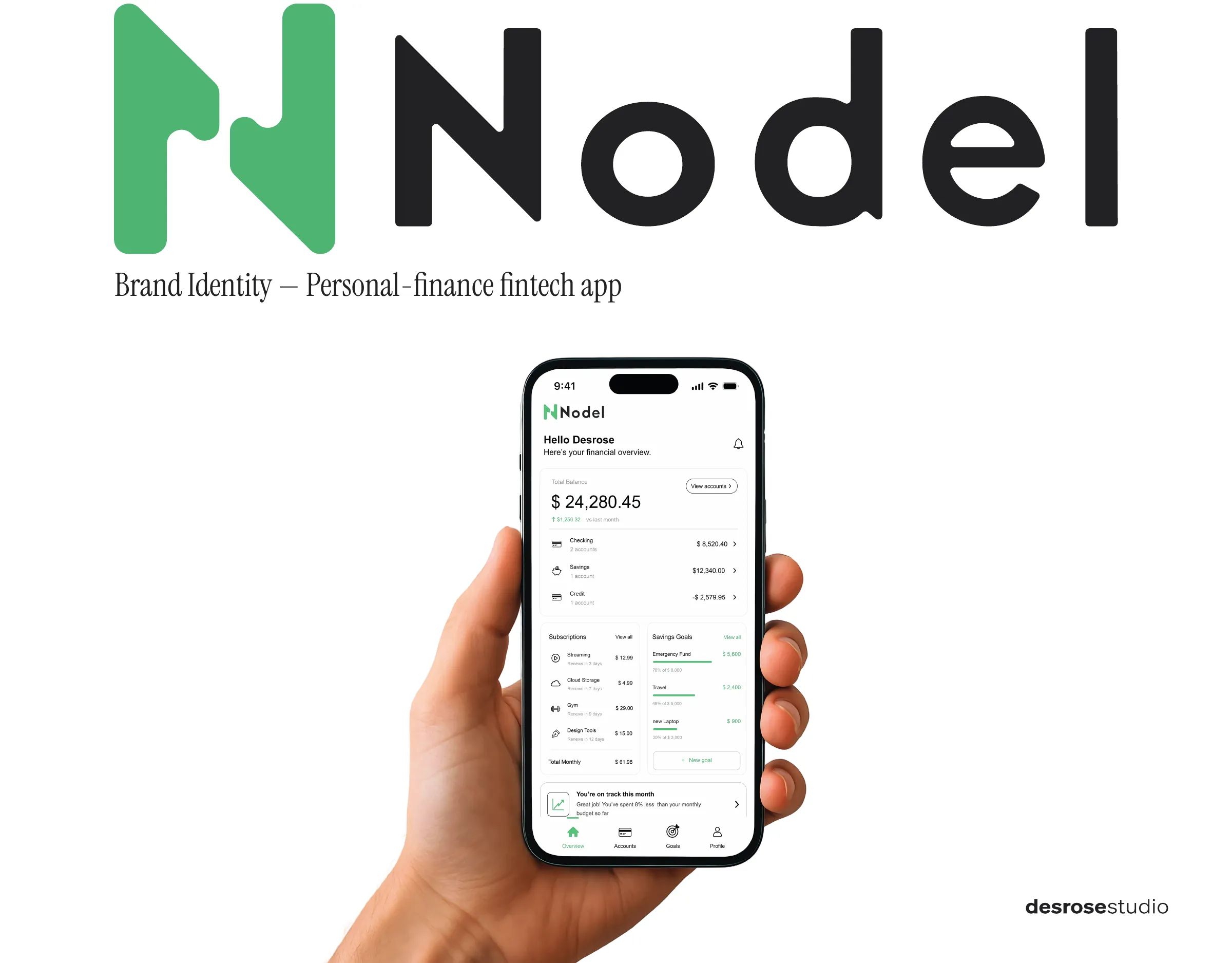
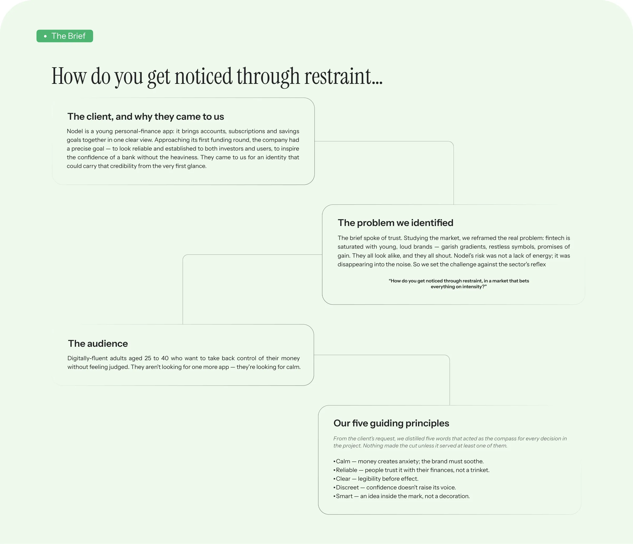
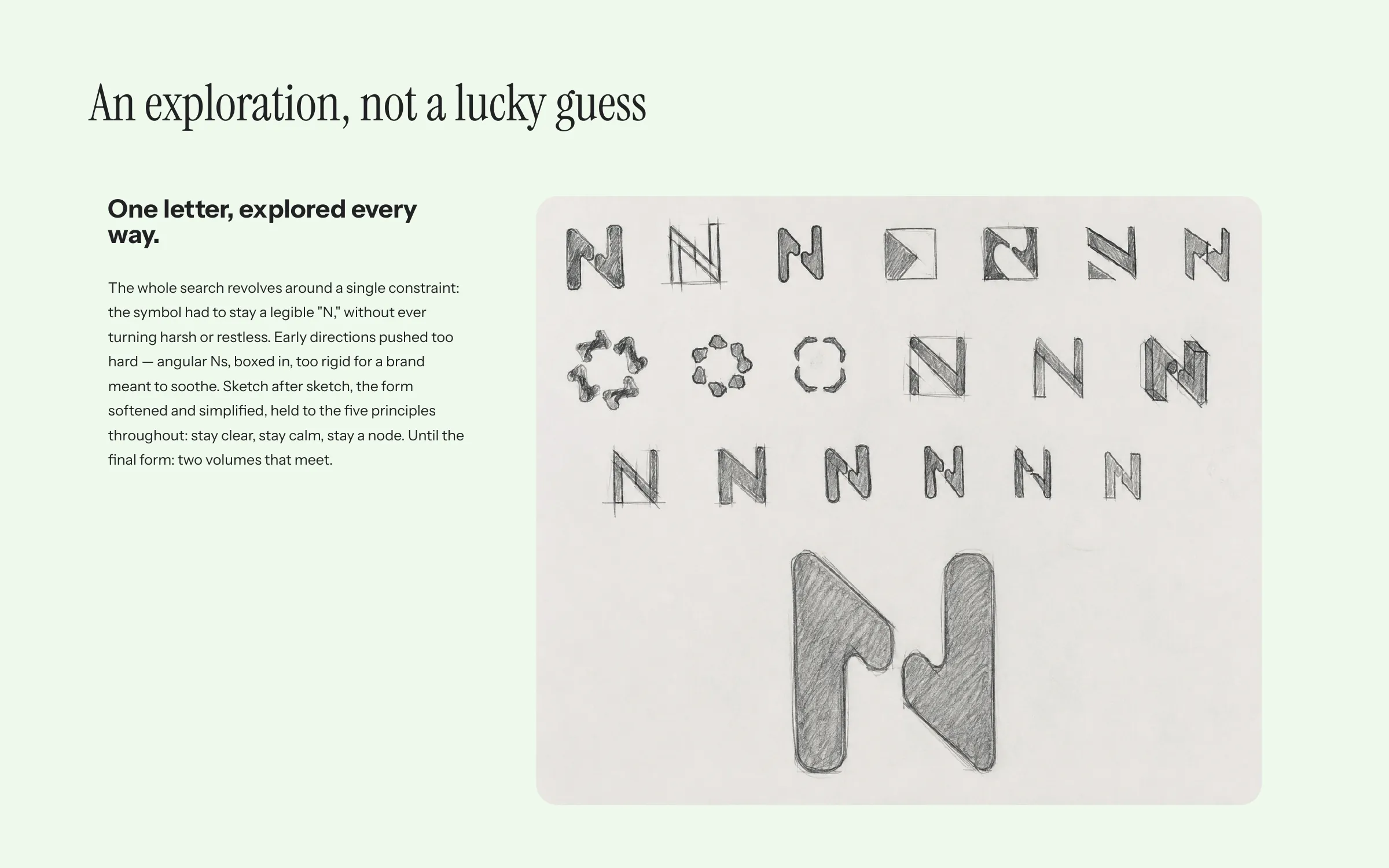
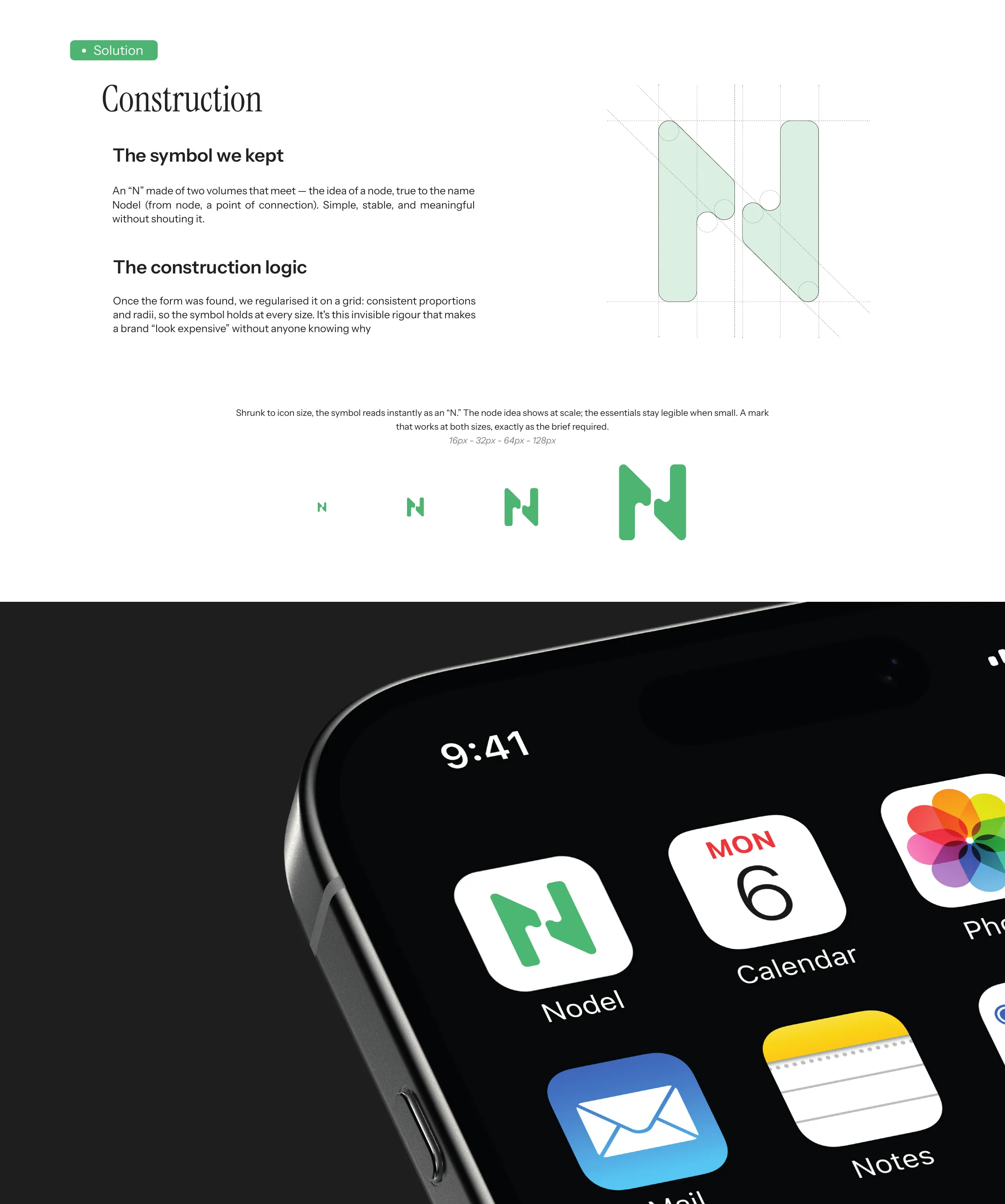
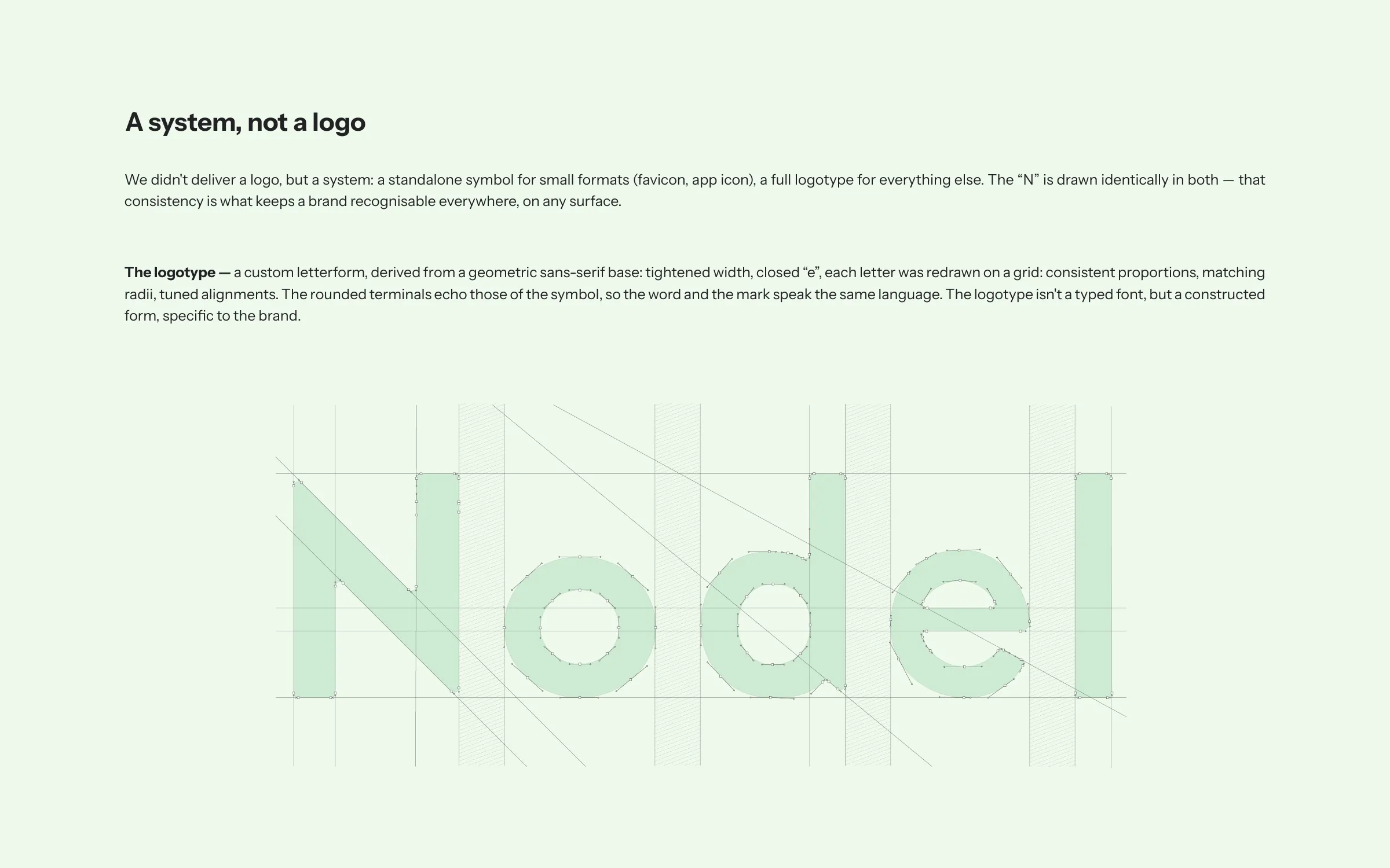
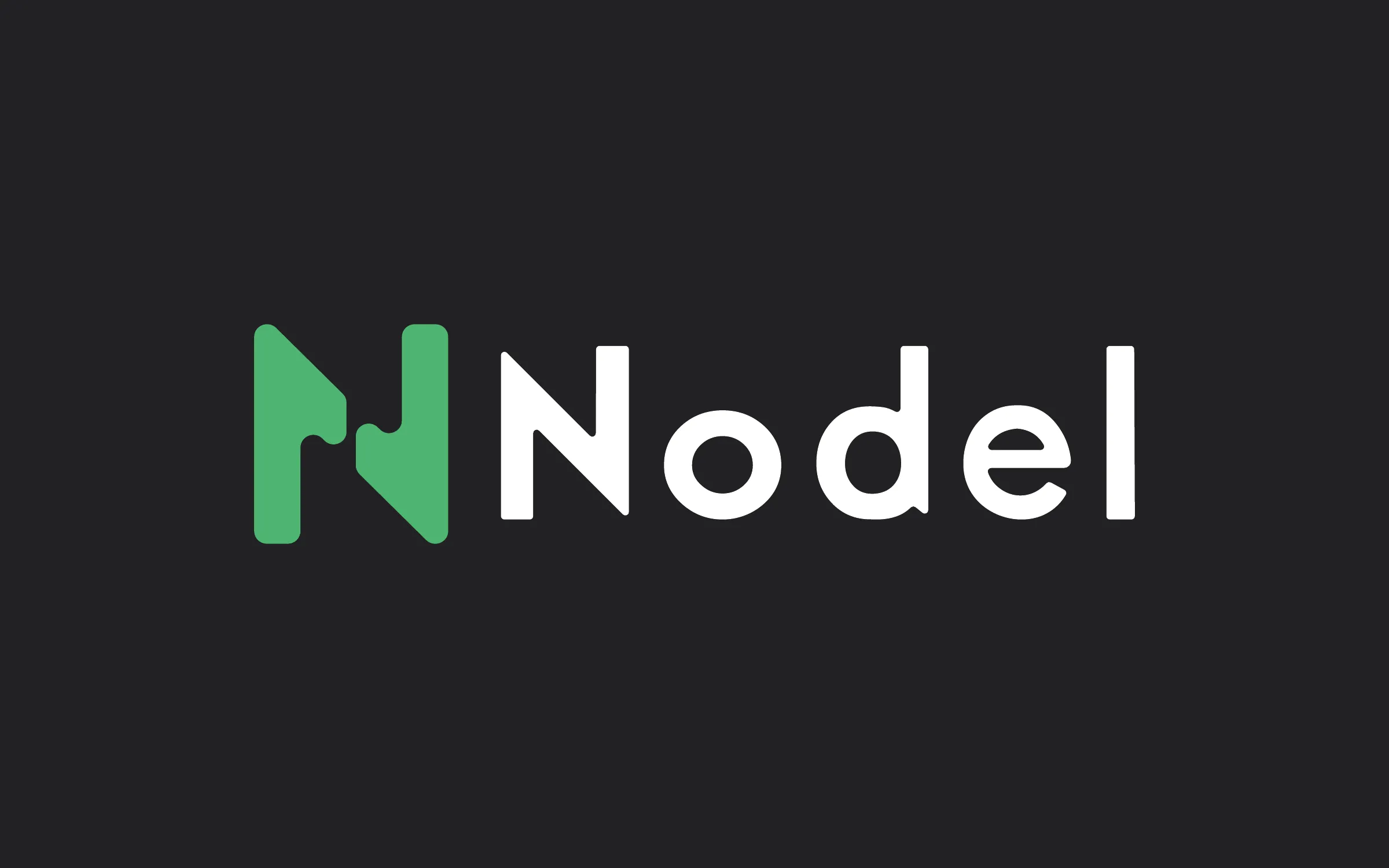
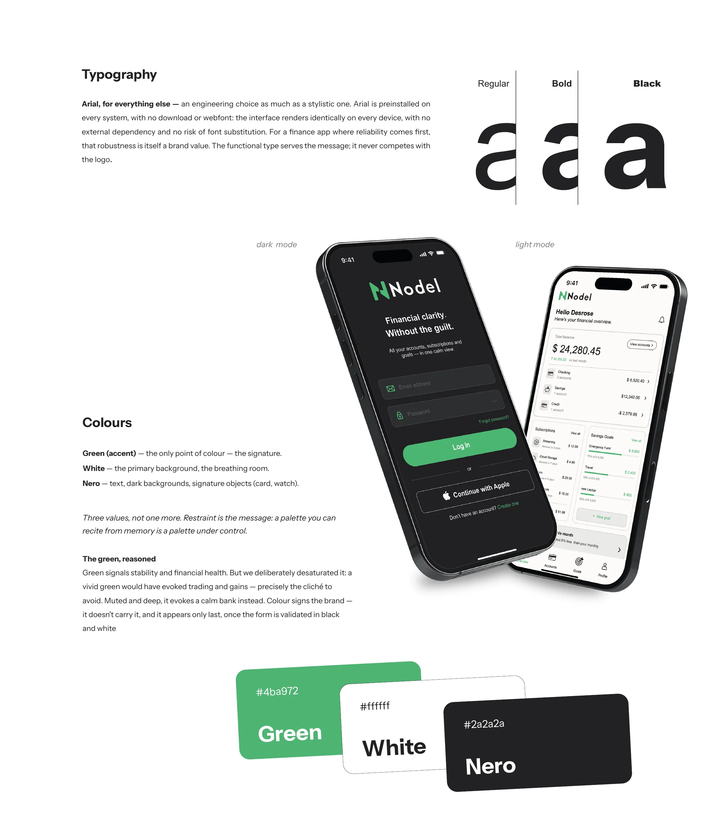
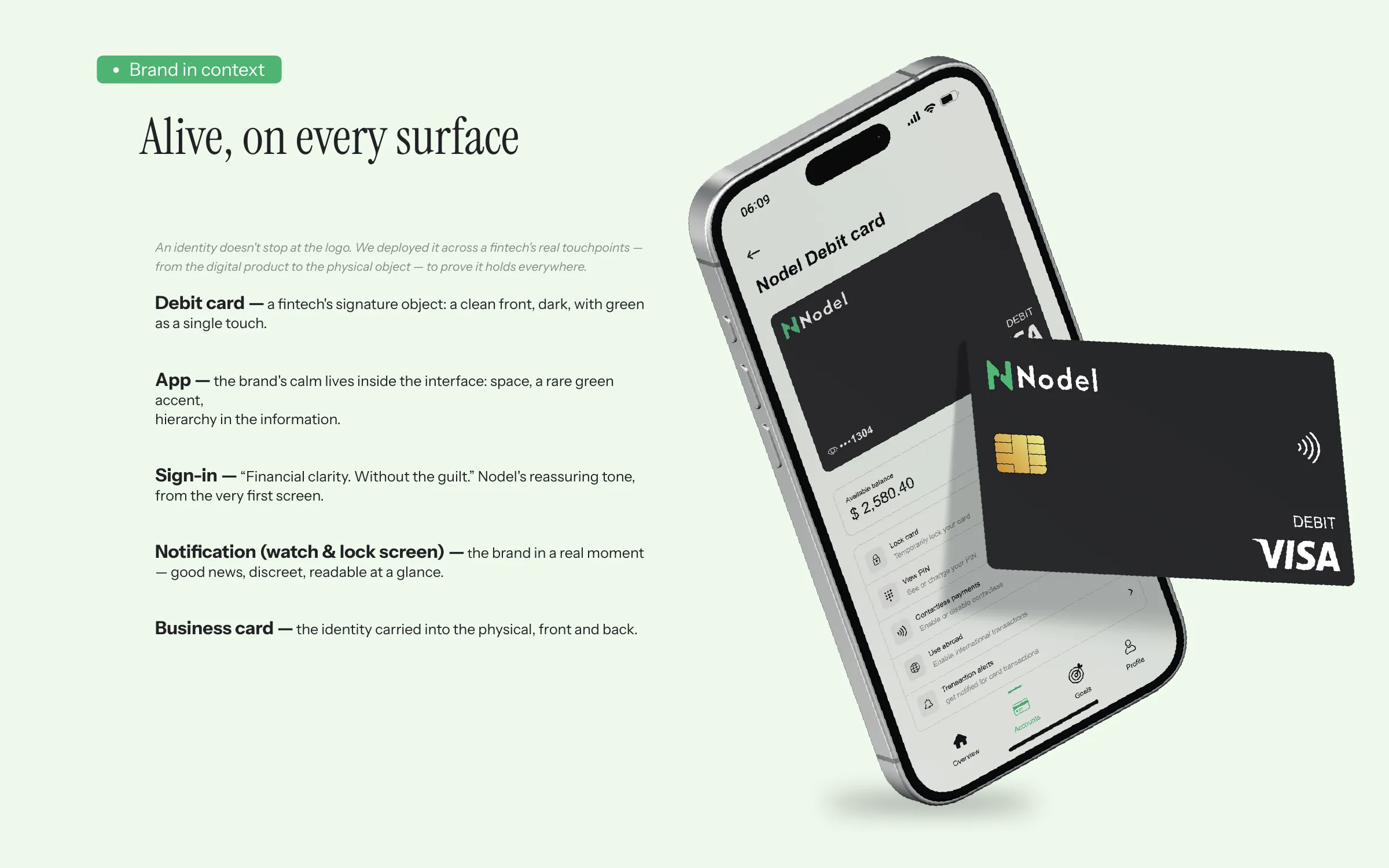
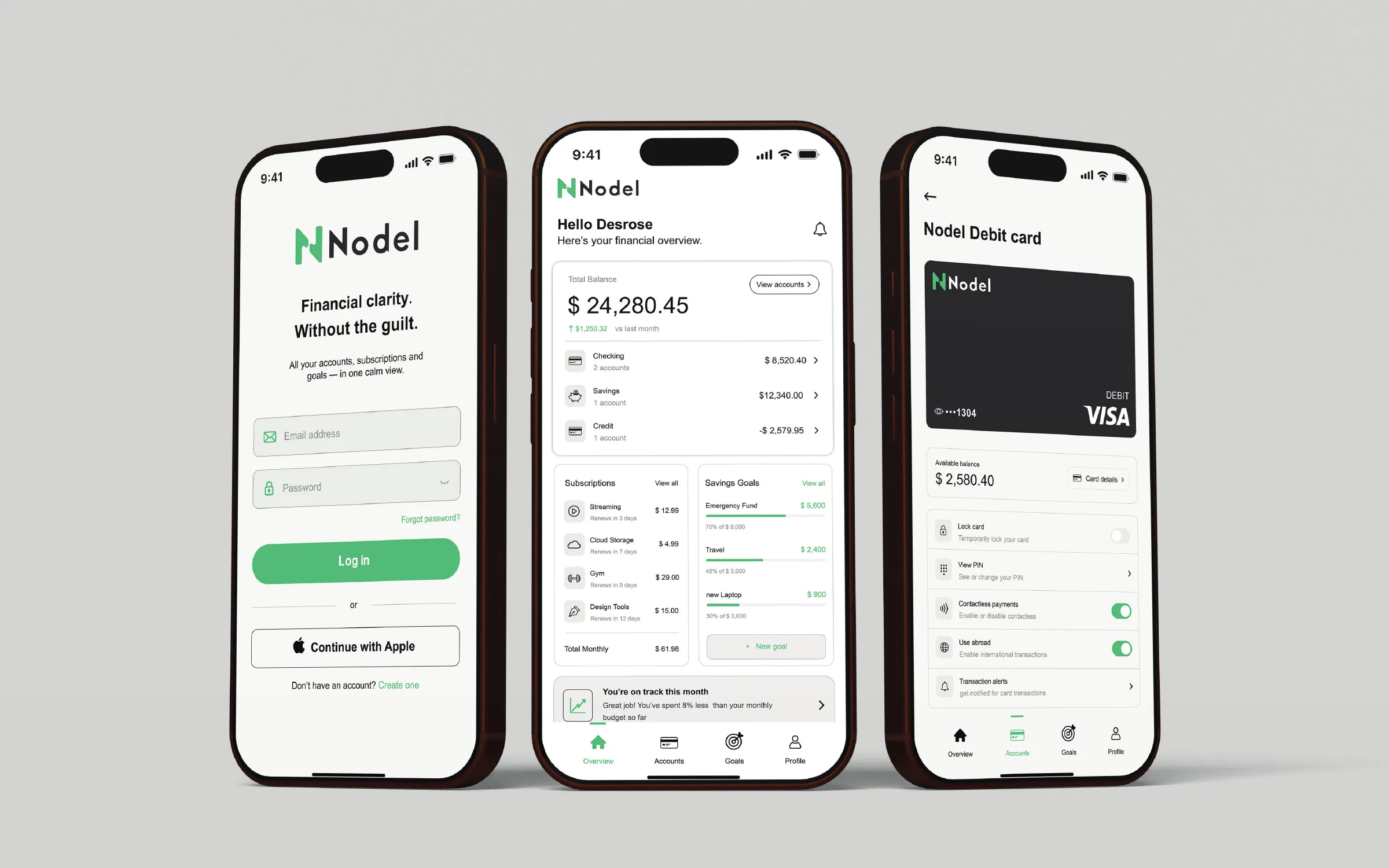
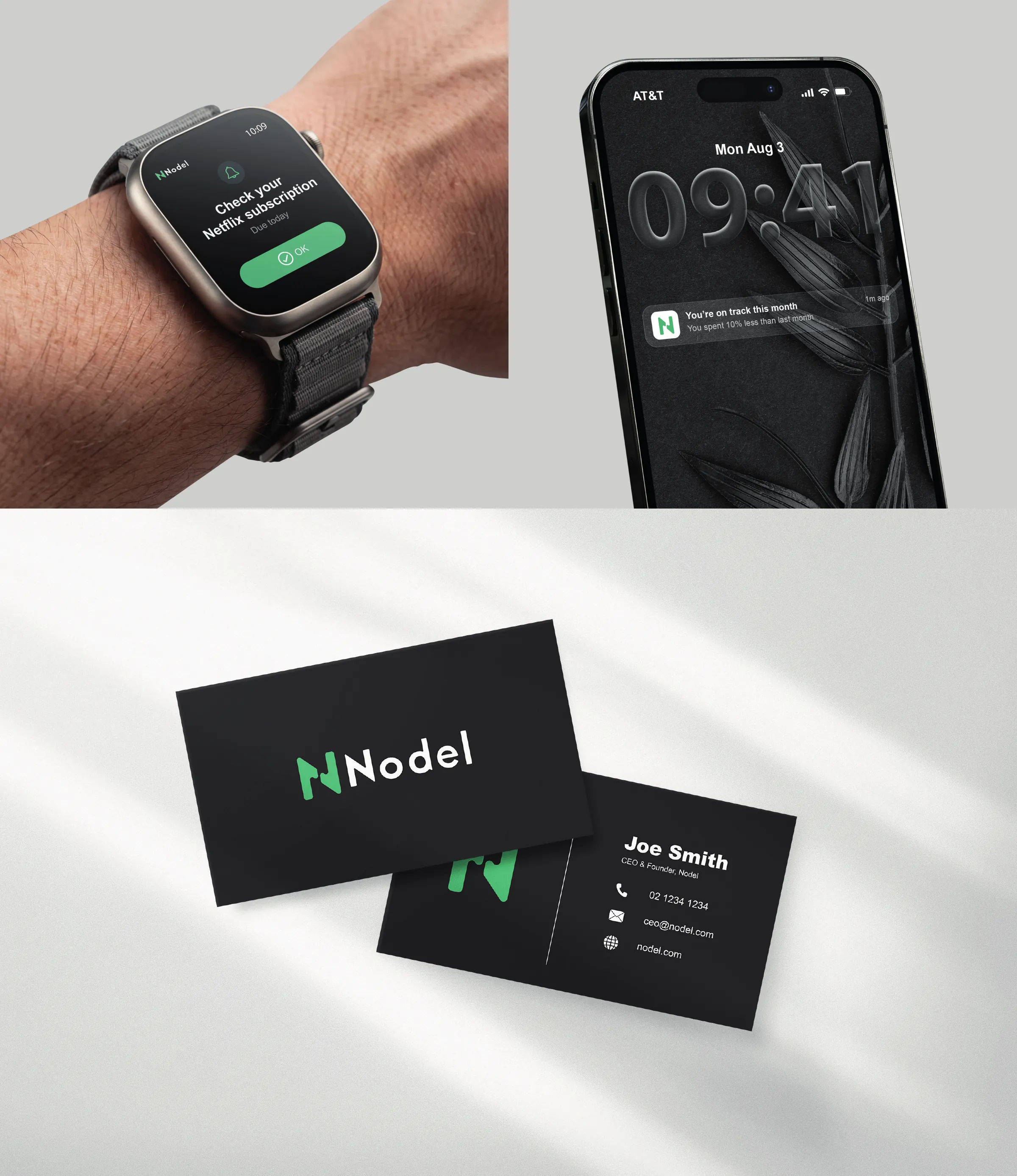
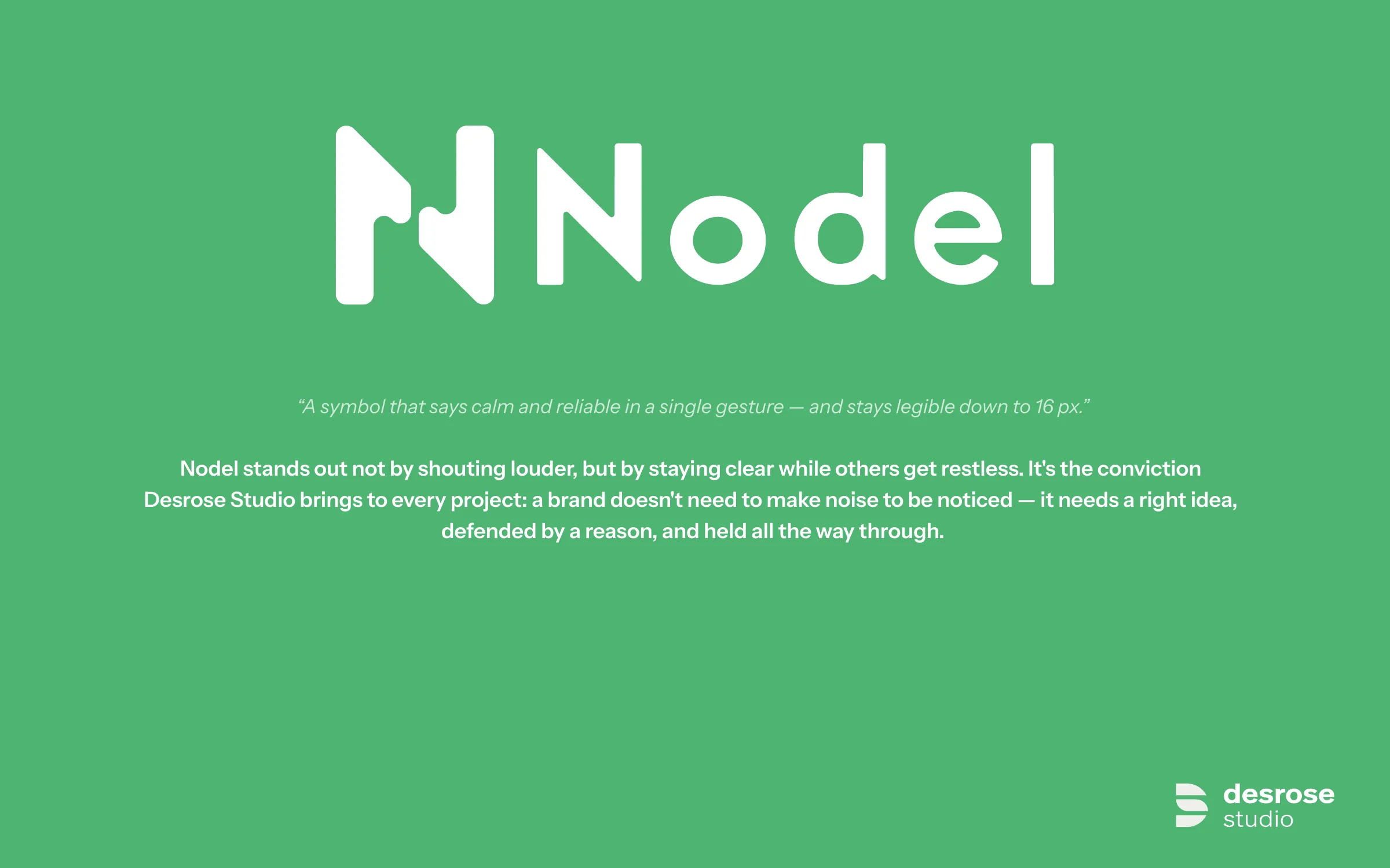
Nodel is a personal-finance app preparing its first funding round. Fintech brands tend to shout: gradients, restless symbols, promises of gain. This identity takes the opposite position, with an N made of two volumes that meet, three colours, and a symbol that stays legible at 16 pixels.
- Sector
- Fintech, personal finance
- Scope
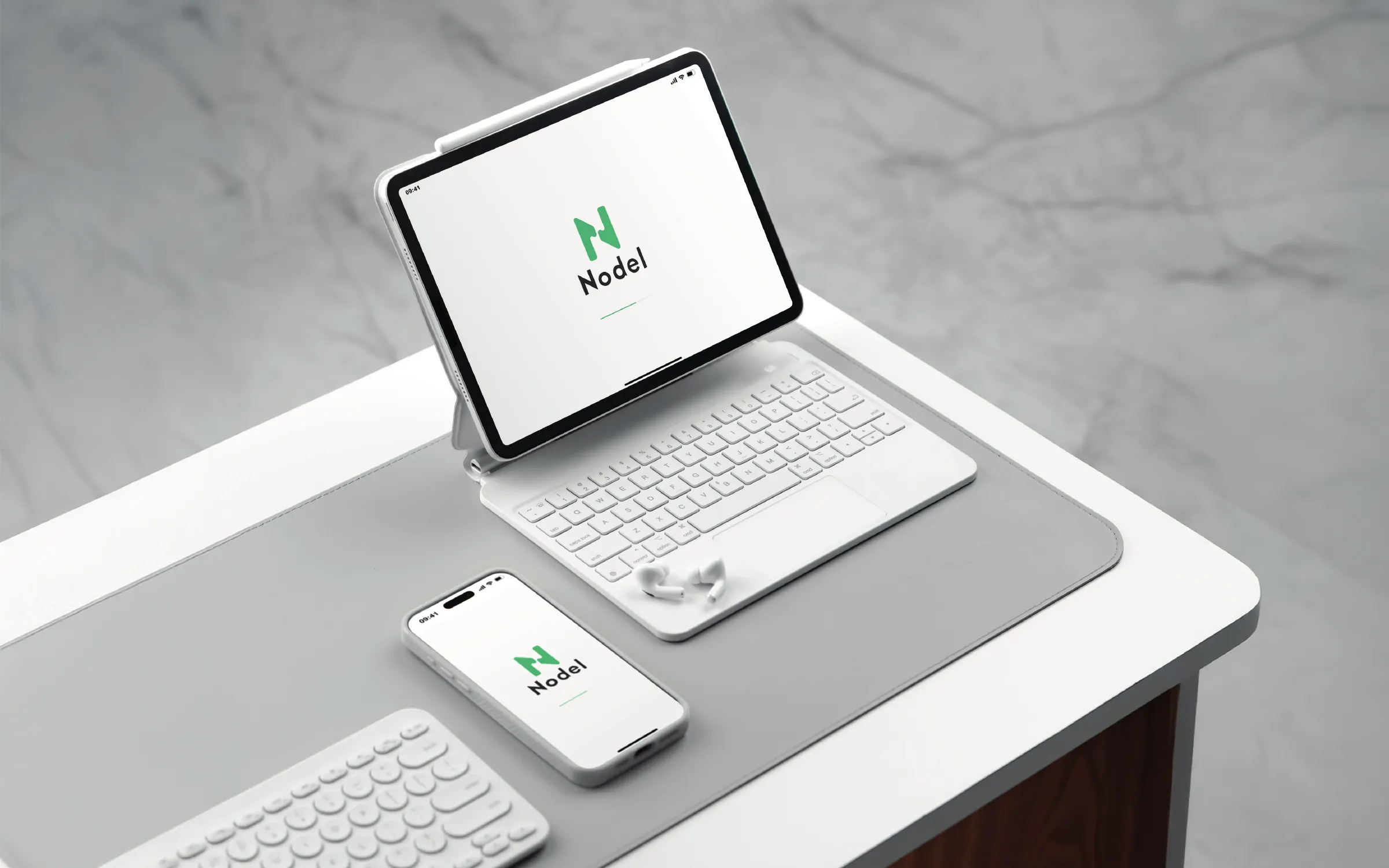
- Symbol, logotype, colour, typography, product application
- Principles
- Calm, reliable, clear, discreet, smart
- Format
- Concept project, 14 boards
Select any board to open it at full size.